Amsterdam Ferry Festival
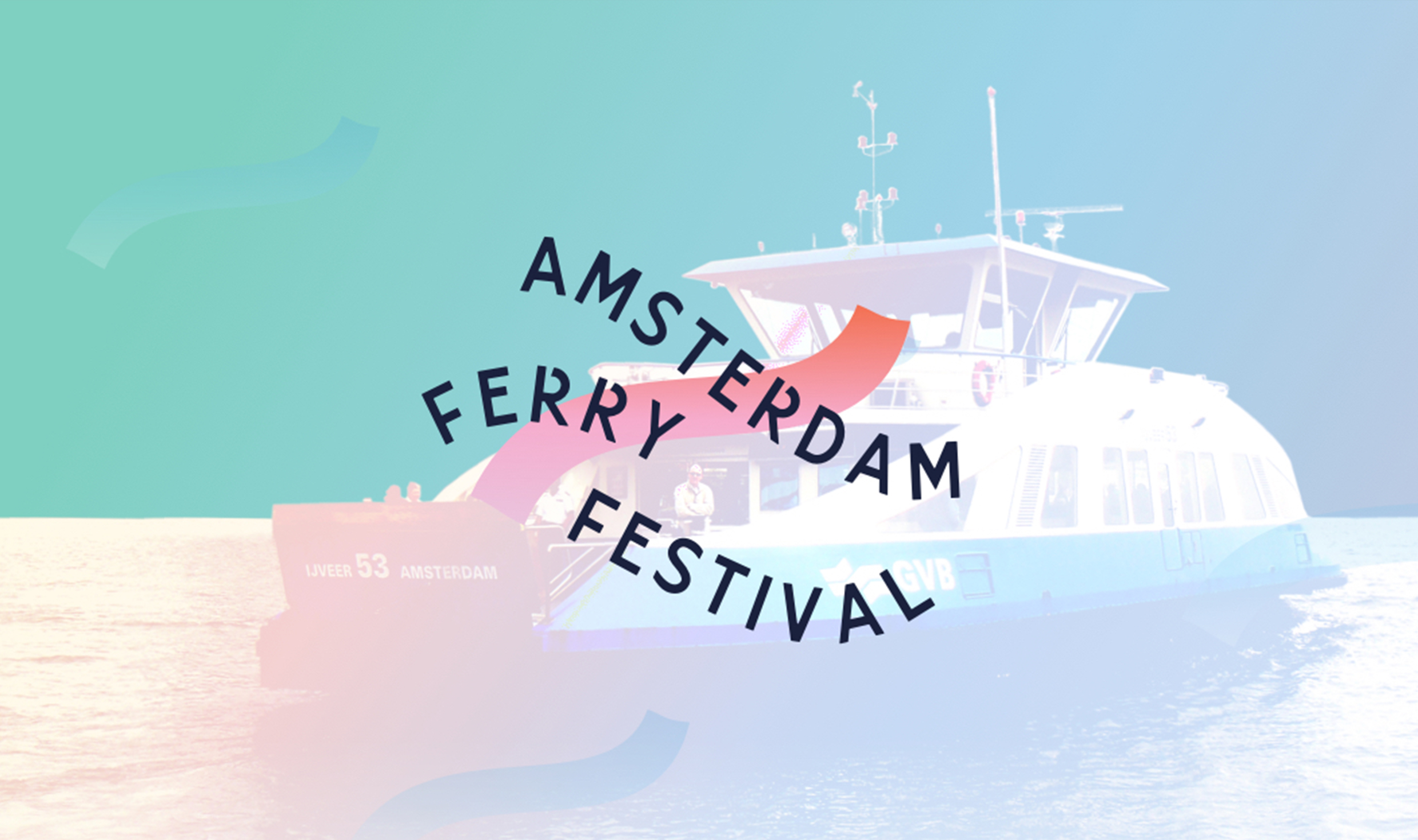
Every day, more than 45.000 people make use of the many ferries that offer transit between North and Central Amsterdam. The ferries offer a welcome break from the hustle and bustle of the city. A full ferry contains a diverse group of 300 people from all walks of life. People with whom we are stuck in a time capsule for a few minutes, as we all make the crossing together. We stop, while the ferries are moving.
While travelling on one of these ferries, Teddy Cherim and Jort Wildschut came up with the concept of the Amsterdam Ferry Festival. They want to use this inspiring, constantly moving, public space to inspire Amsterdam’s daily commuters with effective, colourful and modern art. They approached Wunderwald to design an identity for the festival. The first edition of the festival is planned in the spring of 2020.
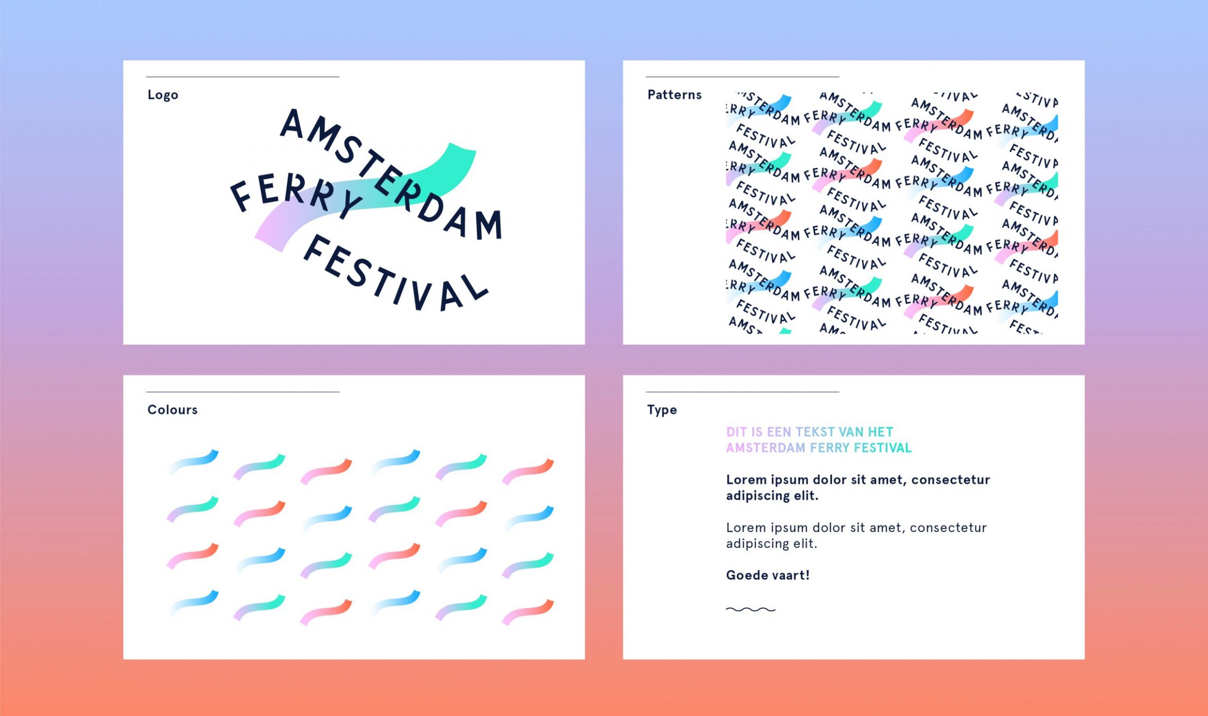
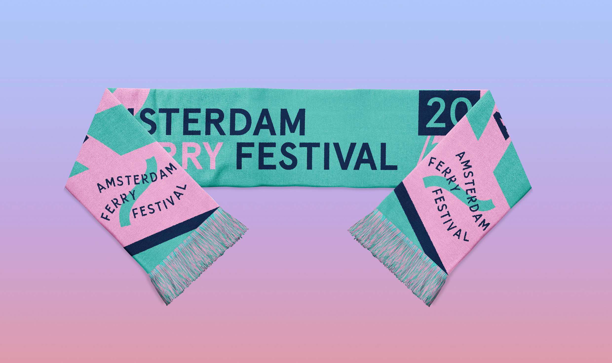
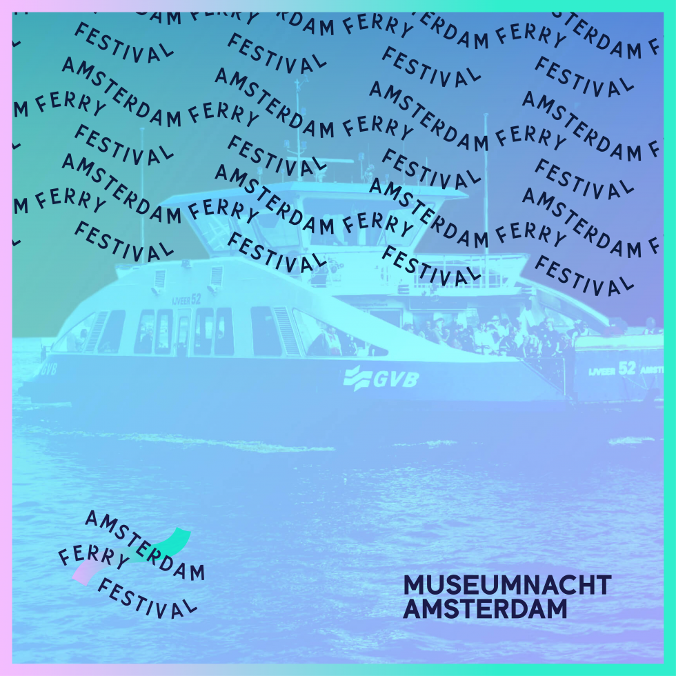
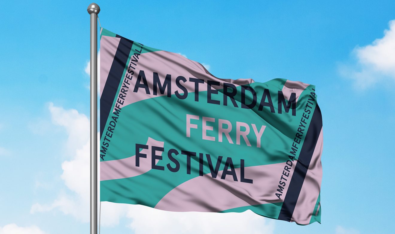
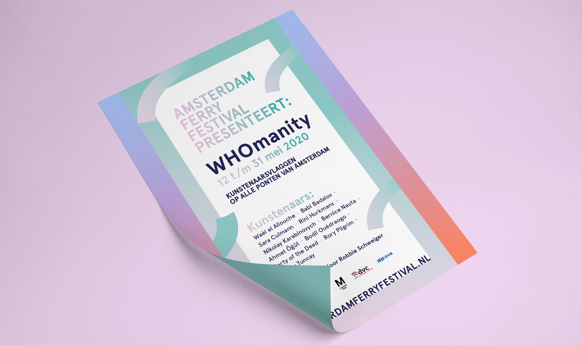
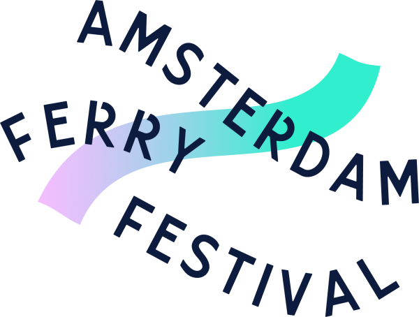
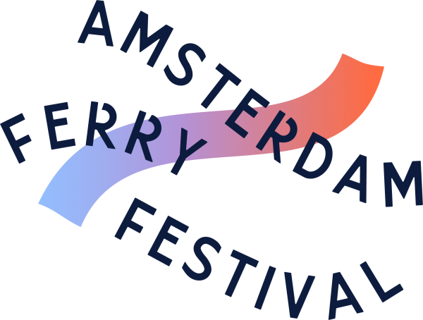
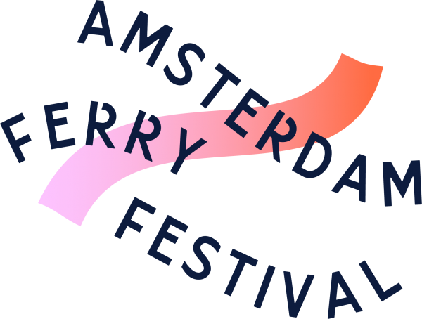
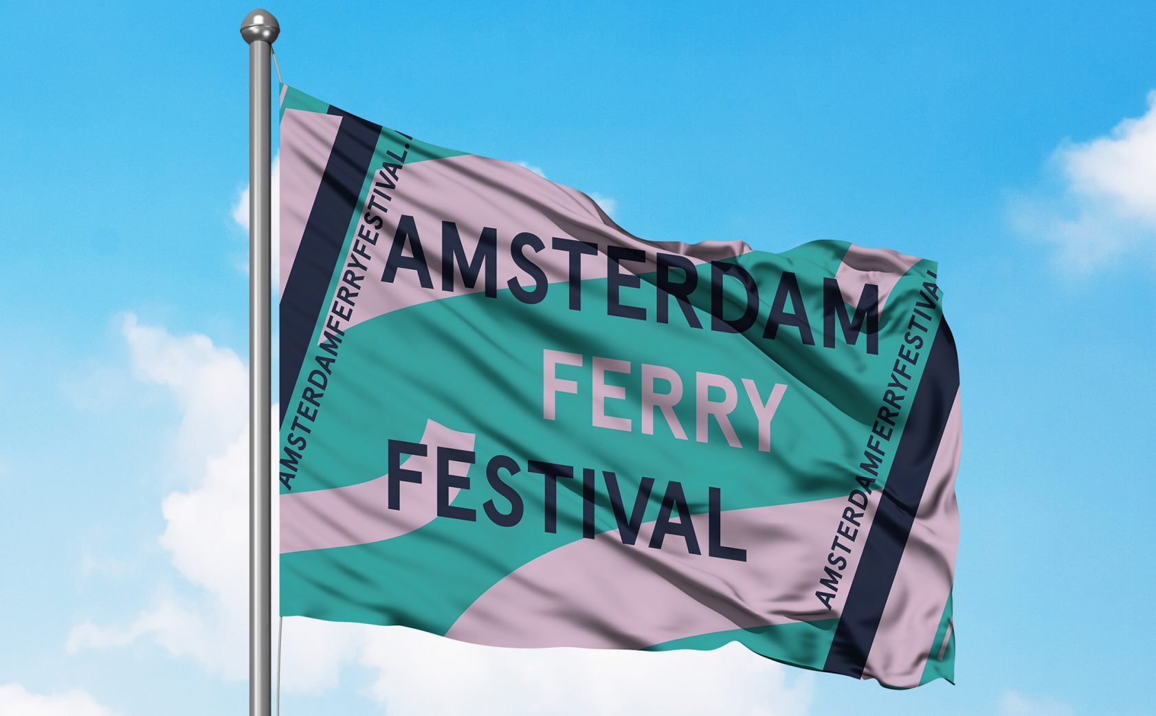
For the identity of the Amsterdam Ferry Festival, we designed the shape of the logo as fluid waves, based on the water through which the ferries travel. The way that the words ‘Amsterdam’, ‘Ferry’ and ‘Festival’ are positioned in relation to each other, reference the different ferry routes or water ways. The logo can be used as an extended pattern through repetition – just like the festival, the logo remains ‘in motion’ through its various applications.
The colours used for the brand identity of the Amsterdam Ferry Festival are mainly blue and green, again referencing the water. These colours are combined with different gradients, mainly red and pink, which can be associated with the sunset and sunrise.
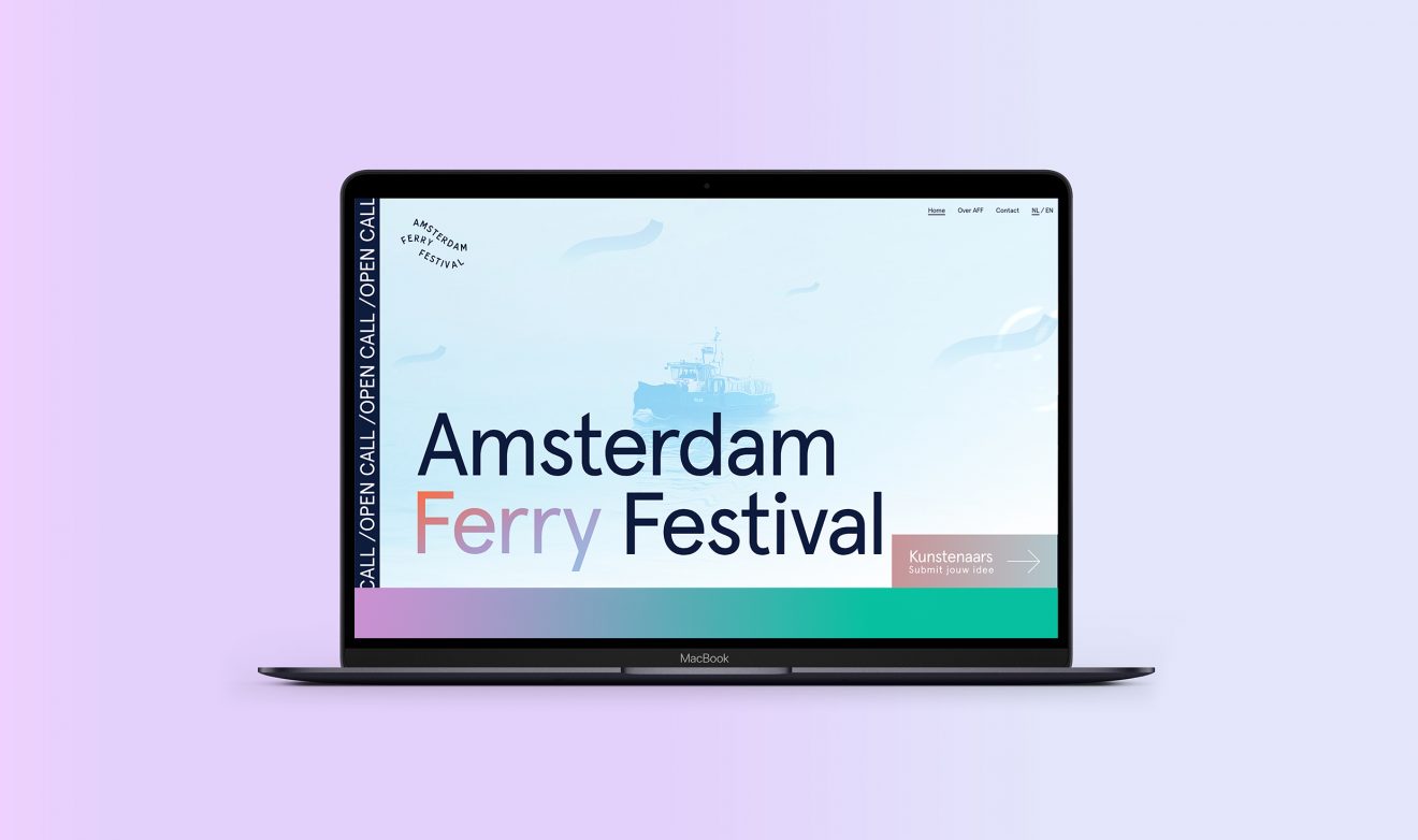
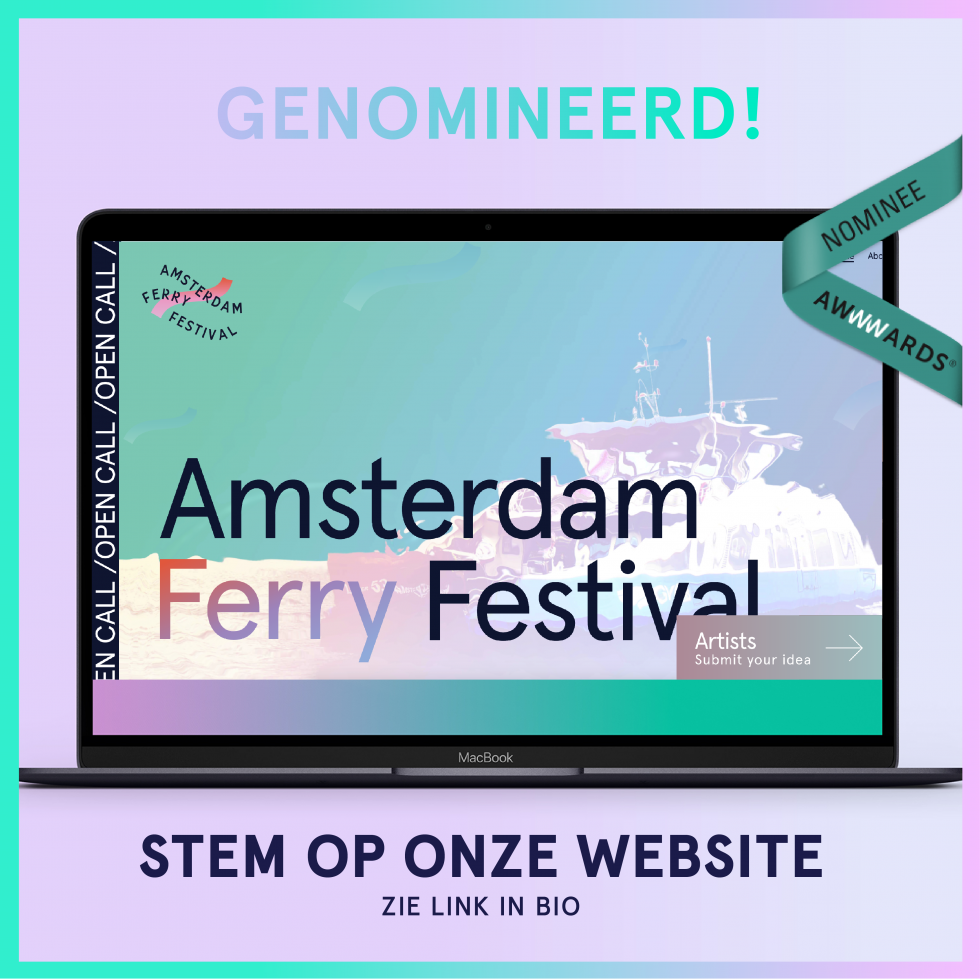
The website is made in cooperation with LamaLama.
